Some of you may be wondering how on God’s green Earth I managed to persuade my big, burly husband that we ought to paint our family room PINK.
It probably helped my cause that he has effectively become colourblind after being outnumbered in a household full of females. #GirlDad. What with me and our three girls, we also had four female dogs for many years. All under one roof! Yikes. Poor Mr Maximalista. He was a prisoner in his own home.
I digress.
My point is that because he is under our constant barrage of femininity, he has become inured to the bubblegum colours foisted upon him by the media, and every toy aisle we’ve walked down.
Truth be told, though, we ended up with a pale pink family room because of my own feminine wiles. How so? Well, because during the colour-choosing process, I was very careful to NEVER use the P-word.
Even when I was in the store ordering the paint, I felt paranoid about saying “PINK”, just in case he intuited (using his man ESP or something similarly sinister) my evil plan to inject more pink into his life.
Another tactic I employed was to ensure he was involved in the colour-choosing process. Of course, we both know that my vote always trumps his, but I think it’s nice for our sense of marital harmony if he thinks he has a say in things.
(Follow me for more marriage tips, Ladies!)
I mentioned in a previous blog how enamored I am with Farrow & Ball, who have some of the most enchanting paint names I have ever encountered. I love how they evoke such warmth, until they start getting a bit dark. We start out with homely-sounding Tallow. Mole’s Breath. Peignoir. Hay. Cabbage White. Whirlybird. And then we move along to Pelt. Plummet. Pitch Black. Dead Salmon. Arsenic…
In seriousness, though, Farrow & Ball is my all-time preferred paint brand. My favourite of their paint names is Charlotte’s Locks, which is a gorgeous kind of burnt orange. The paint colour I pick most is Railings, one of their classics.
For our family room, the choices were:
- Nancy’s Blushes (Mr M nixed that colour, because it looked too pink)
- Middleton Pink (Mr M nixed that one, because it SOUNDED too pink)
- Setting Plaster (close contender, and the name I carefully used when discussing the walls with him)
Anyway, in the long run, thankfully, Mr Maximalista trusted my vision. We went with Pink Ground, in a modern eggshell finish [semi-gloss], to reflect some light into some of the darker corners of our L-shaped room.
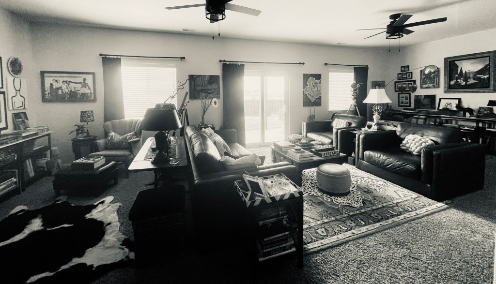
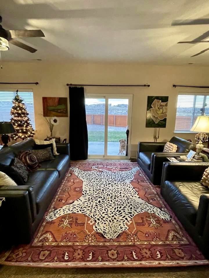
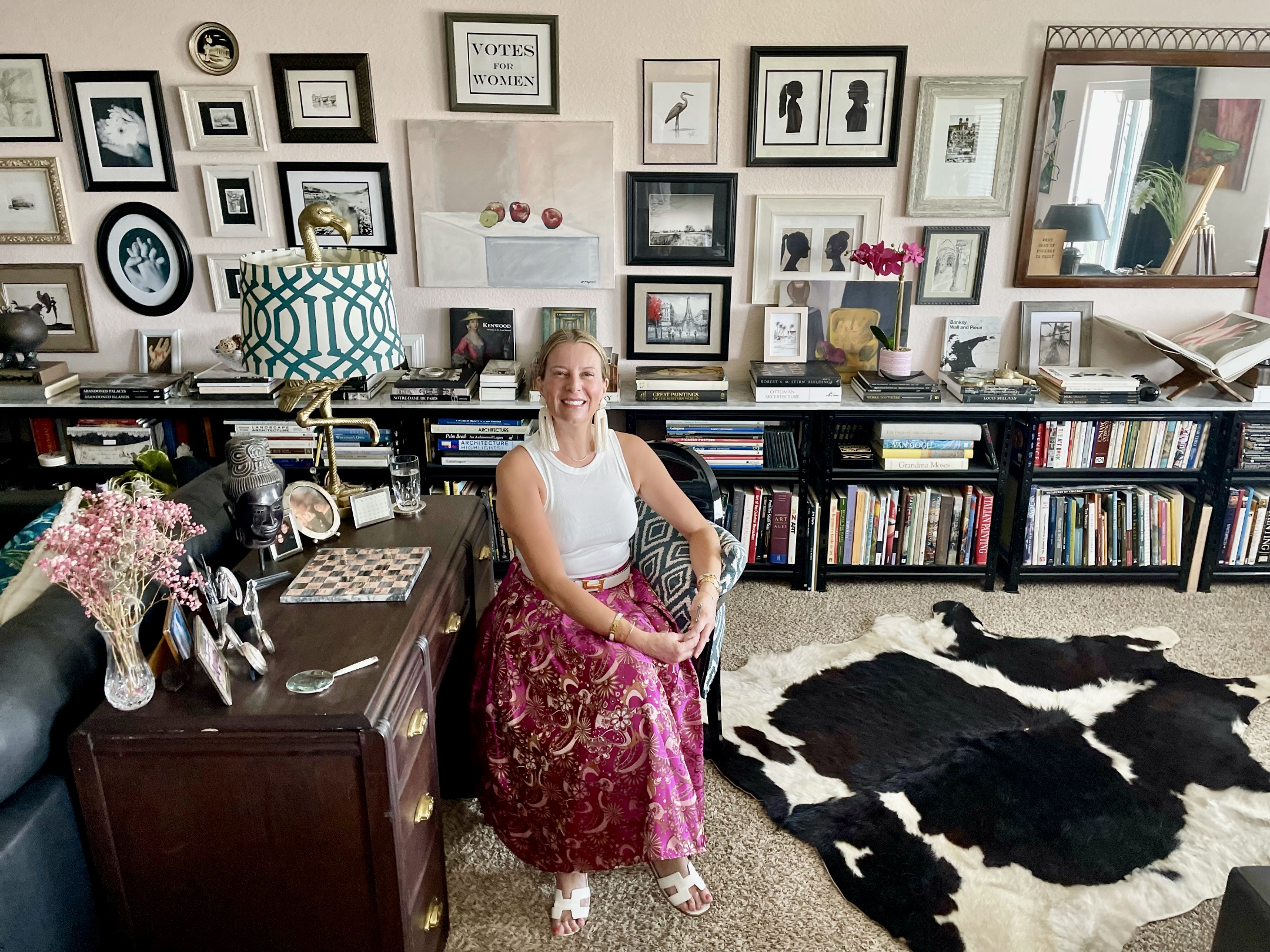
I knew I would be offsetting the pinkishness with more masculine elements, such as the massive black leather couches. Additionally, the black metal bookshelves offer a more industrial vibe. In all, it’s a perfect balance.
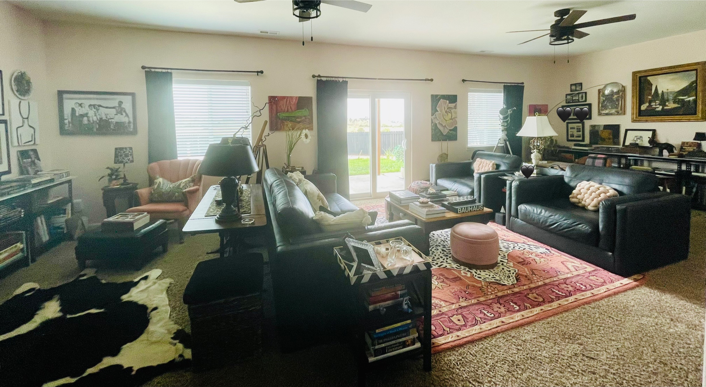
We (I mean *I*) have accumulated a lot of artwork over the years, in predominantly black and/or white frames. This detracts ones’ eye from the Pink Ground background colour. Which incidentally seems to somehow change throughout the day. It’s really quite lovely.
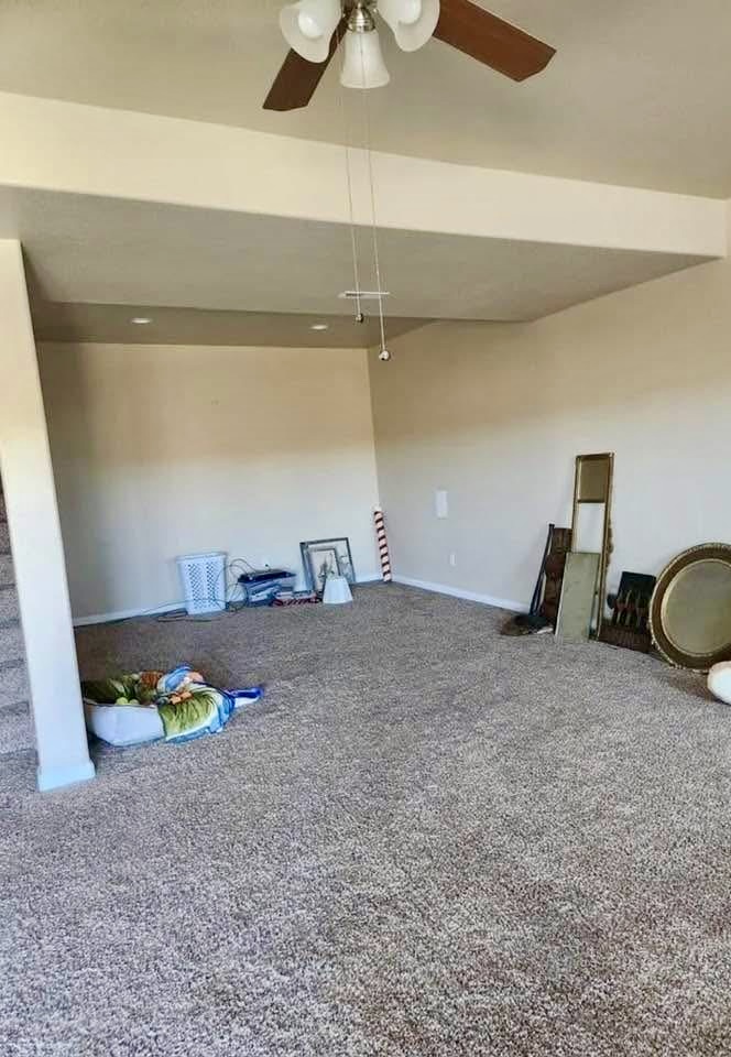
Eventually, we are going to rip out the shaggy carpet, which was here when we bought the house. I’m thinking of oversized polished marble tiles, throughout. But first, I have to come up with something suitable to tell Mr M, so as to not scare him off, since he doesn’t always understand my visions…
Any ideas? Please put them in the comments!
Lots of love,
M xo
Moving in:

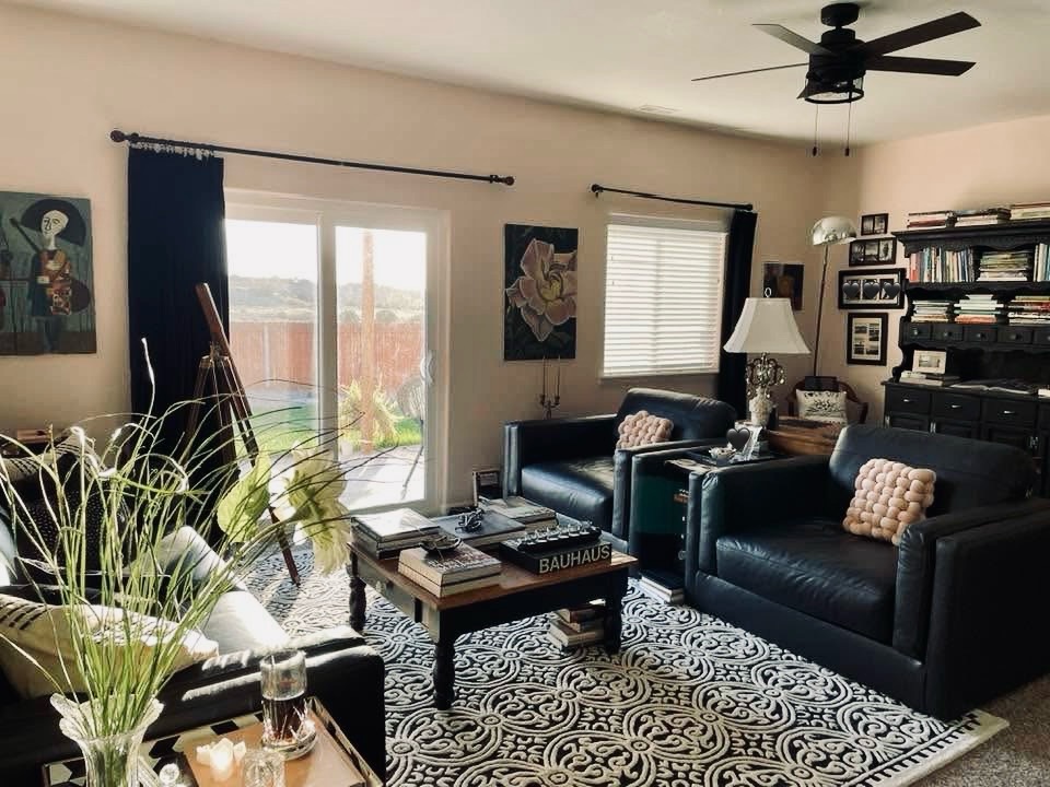
End result:
Cheers!

Leave a Reply to In dog we trust – The English Maximalista Cancel reply